Toolbars on mobile devices
Toolbars can be used to control action view rendering on mobile devices.
Rendering of default action views
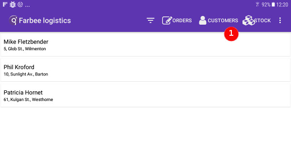
On mobile devices, actions render usually as default action views, that show up implicitly in dedicated panes on the screen, following the platform native user interface rules.
When displaying forms on a mobile front-end, you can use a toolbar to control the rendering of the actions.
For more details, see Action views on mobile devices.
Toolbar action views in GBC chrome (Universal Rendering)
"chrome" value in the
toolBarPosition style attribute of the Window
class:<Style name="Window">
...
<StyleAttribute name="toolBarPosition" value="chrome" />
</Style>
For more details about GBC chrome related style attributes, see Action views with GBC.
Using toolbars for Android™ devices (GMA)
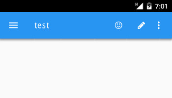
On Android devices, a TOOLBAR can be used to define the action views that appear
in the Android action bar.

Toolbar action views are listed first and ordered as they are defined in the
TOOLBAR section, followed by the default action views for remaining actions that
are not part of the TOOLBAR definition.
Using toolbars for iOS devices (GMI)
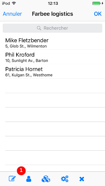
On iOS devices, a TOOLBAR renders as the iOS toolbar panel. This
toolbar appears at the bottom of the screen, displaying a icon or text for each
toolbar item. If there is not enough space to render all toobar items, a three-dot
overflow icon appears on the right, to show up the remaining toolbar items.

The iosSeparatorStretch ToolBarSeparator style attribute
can be used to stretch the toolbar separators to give more space between action buttons.
The background color for the iOS toolbar must be defined with the iosToolbarTintColor style attribute at the Window level.
In order to define the text color for iOS toolbar elements, define the iosTintColor
style attribute at the Window level. However, other form elements such as Folder, Button, SpinEdit
and RadioGroup will be impacted by the attribute defined for Window elements. To overwrite this,
define another iosTintColor for the Form elements.
For more details, see Decorate iOS UI elements.