Action views with GBC
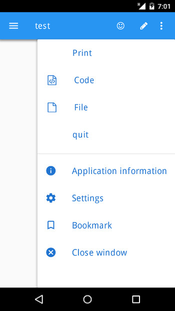
With GBC, default action views and toolbar action views can be displayed in the GBC chrome bar to save space on small screens.
The browser chrome includes the control widgets of the web browser window (menus, toolbars, scroll bars and URL address bar), surrounding the HTML content.
The GBC chrome is the control bar of the GBC front-end, which is by default displayed with a blue background on the top of the Genero application forms.
On iOS and Android™ mobile devices, when using the GBC front-end (for example with Universal Rendering), the default action views of the action panel and ring menu panel, as well as the toolbar action views can be displayed in the GBC chrome.
On mobile devices, this will follow the Material Design specification.

<Style name="Window">
  <StyleAttribute name="actionPanelPosition"  value="chrome" />
  <StyleAttribute name="ringMenuPosition"     value="chrome" />
  <StyleAttribute name="toolBarPosition"      value="chrome" />
</Style
The actions will be rendered in the following order in the GBC chrome bar:
- Toolbar action views
- Default action views of the action panel or ring menu panel
- Common GBC chrome actions (Application information, Settings, Bookmarks, Close window)
When there is not enough room in the GBC chrome, the action views will be rendered in a vertical drop down menu that can be opened from a three-dots button on the right of the GBC chrome bar. This drop down menu will replace the default GBC drop down menu that shows up on small webviews.
"chrome" style attribute
value will be ignored, and the desktop behavior will be enforced. See tabbedContainer style attribute.On mobile, to get the same default rendering as on a desktop browser, use following settings:
<Style name="Window">
  <StyleAttribute name="actionPanelPosition"  value="right" />
  <StyleAttribute name="ringMenuPosition"     value="right" />
  <StyleAttribute name="toolBarPosition"      value="top" />
</Style>tabbedContainer="yes" style attribute, the "chrome" value
is ignored for the actionPanelPosition, ringMenuPosition and
toolBarPosition style attributes. If toolBarPosition is set to
"chrome", it will fallback to the default "top" value. If
actionPanelPosition" or ringMenuPosition is set to
"chrome", it will fallback to the default "right" value.