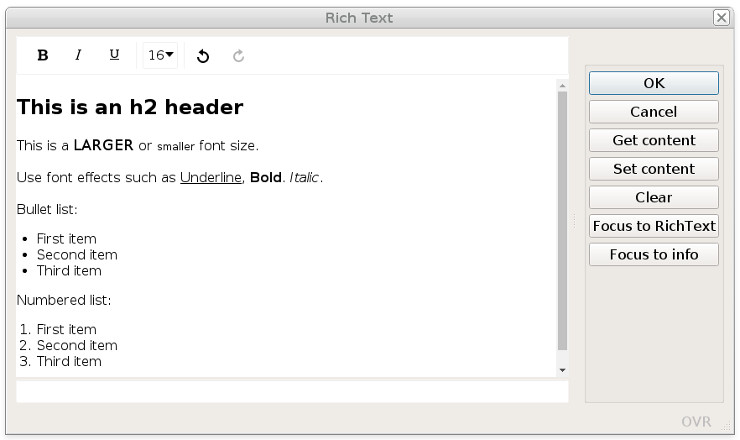
The fglrichtext web component
The fglrichtext built-in web component implements an HTML text
editor.
The fglrichtext built-in web component uses the gICAPI web component framework.
Using images in rich text content
The fglrichtext web component allows insertion of image resources into the text. This can be done
with the image option of the toolbar, by copy/paste, or drag&drop
operations.
image option of the toolbar), the complete image content will be inserted as a
base64 encoded object in the text.When inserting an image resource from a copy/paste from a web resource (like an HTML page), only the URL of the image resource is inserted in the text. If this URL is no longer available, the image will disappear from the text.
Defining the fglrichtext web component in the form file
In your .per form definition file, define the HTML text editor as a WEBCOMPONENT form
item with the COMPONENTTYPE attribute set to the "fglrichtext"
value.
The fglrichtext web component provides its own built-in scrollbars. Therefore,
the SCROLLBARS attribute
can be set to NONE.
Use SIZEPOLICY=FIXED and
STRETCH=BOTH, to get a text
editor that is resized with the parent window.
For example:
LAYOUT
GRID
{
[rt                     ]
[                       ]
[                       ]
...
ATTRIBUTES
WEBCOMPONENT rt = FORMONLY.richtext,
  COMPONENTTYPE = "fglrichtext",
  PROPERTIES = (
    toolbar = "bold|italic|underline|undo|redo"
  ),
  SCROLLBARS = NONE,
  SIZEPOLICY = FIXED,
  STRETCH = BOTH;
...
Properties of the fglrichtext
PROPERTIES:toolbar: Defines the toolbar elements layout.autoflush/autoflush_interval: Defines an action and timer for auto flushing the value.spellcheck: Defines the spell checking in the fglrichtext.noteditable: Defines id the fglrichtext is read-only.- Properties to define the default font:
font_family: Defines the default font family.font_size: Defines the default font size.
- Properties to localize fglrichtext labels:
labels_toolbar_tooltips: Defines the texts to be displayed for toolbar tooltips.labels_toolbar_link: Defines the labels to be displayed for the link popup dialog.labels_toolbar_linespacing: Defines the texts for line spacing options.labels_toolbar_formatselect: Defines the texts to be format options.
Configuring the toolbar
Define the controls to be used in the editor toolbar with the toolbar property
in the PROPERTIES
attribute.
WEBCOMPONENT rt = FORMONLY.richtext,
  ...
  PROPERTIES = (
    toolbar = "bold|italic|underline|undo|redo|emoji"
  ),
  ...
The fglrichtext web component supports the following toolbar items:
| Option name | Description |
|---|---|
aligncenter |
Centers the current block or image. |
alignjustify |
Justifies the current block or image. |
alignleft |
Left aligns the current block or image. |
alignnone |
Removes the alignment of the current block or image and left aligns it. |
alignright |
Right aligns the current block or image. |
bold |
Applies the bold format to the current selection. |
bullist |
Formats the current selection as a bullet list. |
color |
Applies text color to selection. This opens a color picker pop-up, allowing you to choose text and/or background color. |
emoji |
Opens a picker for selecting an emoji to insert into the field. Important: Emoji are not simple images, they are Unicode characters. They may look different
depending on the display device, and may not be supported on some systems. If your device does not
handle emoji, you may need to install fonts that handle emoji characters. |
fontselect |
Dropdown list with font families to apply to selection. |
fontsizeselect |
Dropdown list with font sizes to apply to selection. |
formatselect |
Dropdown list with block formats to apply to selection. |
indent |
Indents the current list item or block element. |
image |
Inserts an image resource found on the local platform. |
insert |
Create and delete links. |
italic |
Applies the italic format to the current selection. |
linespacing |
Defines the line spacing of a selected text. |
numlist |
Formats the current selection as a numbered list. |
outdent |
Outdents the current list item or block element. |
redo |
Redoes the last undo operation. |
removeformat |
Removes the formatting from the current selection. |
strikethrough |
Applies strike though format to the current selection. |
underline |
Applies the underline format to the current selection. |
undo |
Undoes the last operation. |
Using the spell checker
fglrichtext web component can be configured for spell checking with the
spellcheck property of the PROPERTIES
attribute:WEBCOMPONENT rt = FORMONLY.richtext,
...
PROPERTIES = (
spellcheck = "browser"
),
...spellcheck property can be set to the following values:"browser"(default): This will enable the intrinsic spell checking of the browser."none": No spell checking is required for this rich text field.
spellcheck property is supported by the GDC and GBC. It
is not supported by GMI or GMA.Auto-flushing the rich text content
By default, the text value of an fglrichtext field is only flushed to the
runtime system, when focus leaves the field or when firing an action.
autoflush property of the PROPERTIES attribute allows you to define a user action to be fired every
autoflush_interval seconds, when the text is changed. The default for
autoflush_interval is 10 seconds.autoflush action will be fired every autoflush_interval seconds.
After the autoflush action is sent, if the user does not modify the text, no action
will be fired until the user starts again to type text. This way, the network traffic is
optimized.WEBCOMPONENT rt = FORMONLY.richtext,
...
PROPERTIES = (
autoflush = "save_text",
autoflush_interval = 5 -- Flush every 5 seconds
),
...In the program code, implement an ON ACTION handler using the action name that
matches the autoflush property of the WEBCOMPONENT field. When the
action is fired, the rich text will be available in the WEBCOMPONENT field value.
Use the UNBUFFERED dialog
mode to have the text automatically copied into the program variable bound to the form field:
INPUT BY NAME rec.richtext, -- Variable bound to the WEBCOMPONENT form field
              ...
      ATTRIBUTES(UNBUFFERED) -- To get the input buffer copied into the variable
   ...
   ON ACTION save_text ATTRIBUTES(DEFAULTVIEW = NO)
      UPDATE ord_info SET oi_comment = rec.richtext
             WHERE oi_pkey = curr_pkey
   ...
Auto-flush can for example be used to implement automatic backup of the text content.
Defining the rich text field as read-only
TEXTEDIT NOTEDITABLE attribute, it is possible to make the
fglrichtext web component read-only, by defining the noteditable
property:WEBCOMPONENT rt = FORMONLY.richtext,
...
PROPERTIES = (
noteditable = true
),
...Specifying the default font
fglrichtext web
component by using the following properties:| Property name | Values |
|---|---|
font_family |
Monospace, Sans serif, Serif, Roboto |
font_size |
nnnpx |
WEBCOMPONENT rt = FORMONLY.richtext,
  ...
  PROPERTIES = (
   font_family = "Monospace",
   font_size = "25px"
  ),
  ...
The font_size defines the px unit, otherwise, the
property will be ignored.
If the toolbar items fontselect / fontsizeselect
are used, they will display the font family and font size defined by the properties,
when the fglrichtext initializes.
If the user moves the edit cursor to a text element that uses a different font to the one specified with these attributes, the richtext will reset the current font settings to match that text element.
Localizing rich text component strings
The toolbar button tooltips, combobox items, and popup dialog labels of the
fglrichtext web component can be localized with dedicated
properties.
label-localization-property = '{ "item-name" : "item-label" [,...] }'| Property name | Items/Keys |
|---|---|
labels_toolbar_tooltips |
"aligncenter", "alignjustify", "alignleft",
                                    "alignnone", "alignright", "bold", "bullist", "color",
                                    "backgroundcolor", "emoji", "fontselect", "fontsizeselect",
                                    "formatselect", "title", "image", "indent", "insert", "numlist",
                                    "outdent", "redo", "removeformat", "strikethrough", "underline",
"undo", "linespacing" |
labels_toolbar_link |
"save", "label", "edit", "visit",
"remove" |
labels_toolbar_linespacing |
"small", "normal", "large", "huge" |
labels_toolbar_formatselect |
"heading", "normal" |
labels_toolbar_linespacing, the
item/key names must be specified in lowercase ( "small":"Petit",
not "Small":"Petit" )For example (not using localized strings):
WEBCOMPONENT rt = FORMONLY.richtext,
  ...
  PROPERTIES = (
   labels_toolbar_tooltips = '{ "aligncenter":"Centré", "alignjustify":"Justifié",  ... }'
   labels_toolbar_link = '{"save":"OK","label":"Entrez un lien:"}'
   labels_toolbar_linespacing = '{"small":"Petit","normal":"Normal","large":"Grand", ... }'
   labels_toolbar_formatselect = '{"heading":"Titre","normal":"Normal"}'
  ),
...labels_toolbar_tooltips = %"rtlabels.toolbar.tooltips"rtlabels.toolbar.tooltips = '{ "aligncenter":"Centré", "alignjustify":"Justifié", ... }'